Key Takeaways: Room-by-Room Colour Guide
-
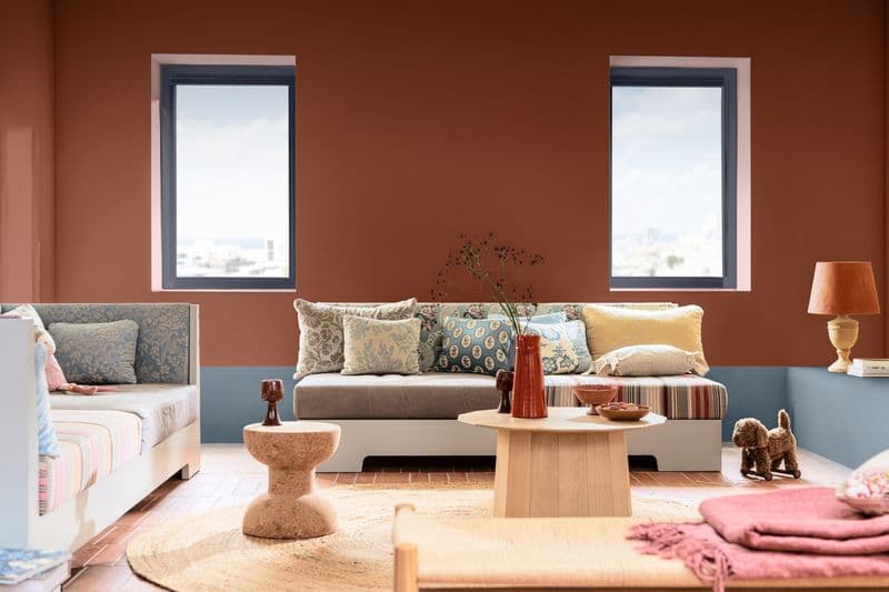
Living Rooms: Warm neutrals like Sahara Drive (33YY 65/106) and earthy tones like Cottage Chocolate (70YR 13/140) encourage connection and a welcoming feel.
-
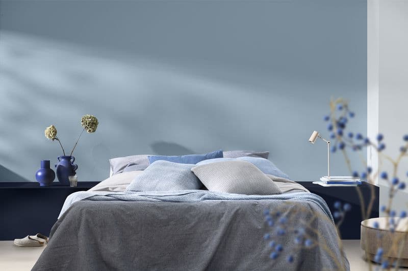
Bedrooms: Soft blues like Horizons (10BB 73/039) and deep indigos like Slow Swing™ (66BB 06/077) are ideal for creating a calm, restful retreat.
-
Kitchens: Cooler tones like blues and greens improve focus and reduce mental fatigue.
-
Home Offices: Always use washable, low-sheen paint for walls and durable, moisture-resistant enamel for cabinets.
Colour is more than just a finishing touch. It has a powerful impact on how your home feels, functions, and flows. The shades you choose can influence your mood, your energy, and how comfortable a space feels at different times of the day. By understanding a little bit about colour psychology, you can make more confident choices and create spaces that not only look beautiful, but set the right mood. Here is a guide to choosing the right colour for every space in your Zimbabwean home:
Living Room Paint: Warm, Welcoming & Social
Your living room is where life happens. Whether you’re enjoying a relaxed evening or hosting friends and family, warm neutrals like Sahara Drive (33YY 65/106), soft earthy tones like Cottage Chocolate (70YR 13/140), and muted greens like Brave Olive (24YY 28/384) help create a space that feels inviting and comfortable. These colours make people feel at ease and encourage connection, without overwhelming the room.
Bedroom Colours: Calm & Restful
Your bedroom should feel like a retreat from the outside world. Soft, airy blues like Horizons (10BB 73/039), gentle greys like Cameo Stone (60YR 64/038), and deeper, grounding shades like Slow Swing™ (66BB 06/077) are ideal for creating calm and restful environments. These colours help your mind switch off, making it easier to relax and unwind at the end of the day. Keeping the palette soft and balanced is key - this isn’t the place for overly bright or high-energy colours.
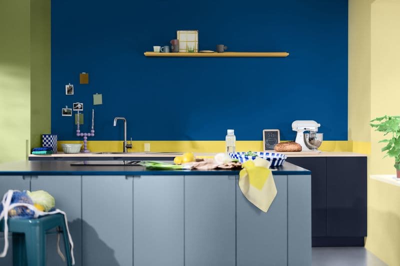
Kitchen Paint: Fresh, Clean & Energising
The kitchen is often the heart of the home, so it should feel fresh and uplifting. Light neutrals and soft whites like Clinic White (83YY 88/033), alongside subtle greens like Bamboo Twist (30GY 50/183), can make the space feel clean, open, and full of life. If you want to introduce a bit more energy, small pops of colour, such as the warm yellow of Citrus Sunburst (60YY 55/504) on cabinetry or accessories, can add personality without overpowering the space.

Home Office Inspiration: Focused & Inspiring
Whether you’re working from home full-time or just need a space to concentrate, colour can make a big difference. Cooler tones like the vibrant Free Groove™ (62BB 08/369) or the airy Horizons (10BB 73/039) help improve focus and reduce mental fatigue. However, adding a pop of warm, contrasting colour like Espadrille (18YR 05/072) somewhere on a bookshelf or accent piece can spark creativity!
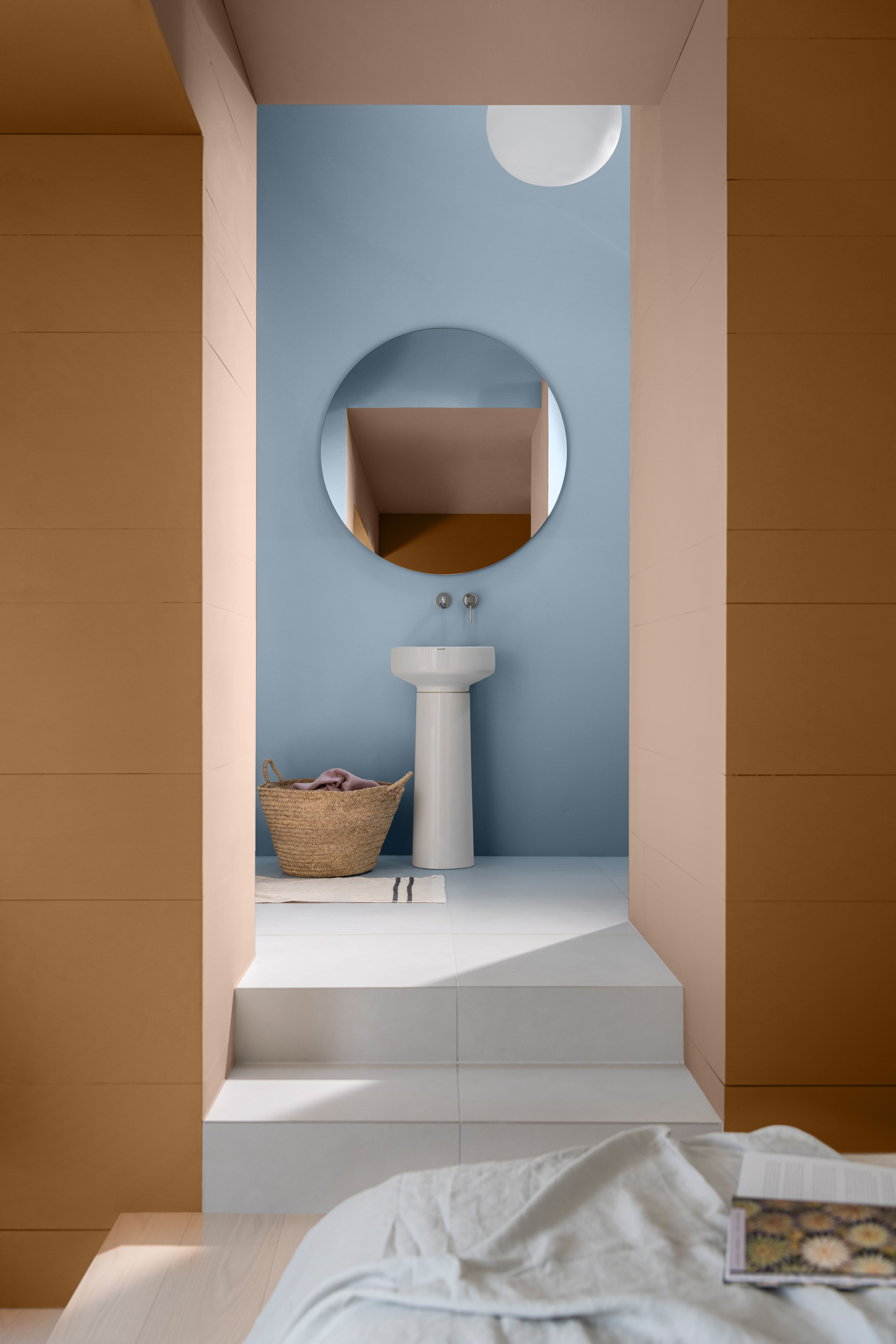
Bathroom Hues: Clean & Relaxing
Bathrooms should feel fresh, clean, and slightly spa-like. Whites and soft greys like Horizons (10BB 73/039) work beautifully to create a sense of calm and cleanliness. Soft greens like Bamboo Twist (30GY 50/183) or warm neutrals like Del Mar Shores (65YY 84/081) can create a more natural, relaxed feel while keeping the space light and airy.
Frequently Asked Questions (FAQs) About Kitchen Paint
**How does lighting affect paint colour? ** The same colour can feel completely different depending on how it’s used. Natural light, room size, and what you pair it with all play a role in the final result. Lighter shades like Clinic White (83YY 88/033) can make a room feel bigger and more open, while deeper tones like Cottage Chocolate (70YR 13/140) create warmth and intimacy.
What is the most relaxing colour to paint a bedroom? Soft blues like Horizons (10BB 73/039), gentle greys, and muted pastels are highly recommended for bedrooms. These calm, balanced shades help the mind switch off and make it easier to unwind.
Where can I get expert paint advice in Zimbabwe? Finding the right balance can be overwhelming, but Dulux colour consultants are available to help. You can easily book an appointment by sending a WhatsApp message to +263 78 293 6824.
For more information about the Colour of the Year 2026, visit the webpage. You can also follow the #COTY26 #AkzoNobel #Dulux #ABlueForYou! #BelieveInblue and #RhythmOfBlues hashtags on social media.
For more tips, colour inspiration and ideas on how to add pride, imagination and creativity to your home or workspace, visit the Dulux social media pages Facebook, Instagram or Pinterest.
