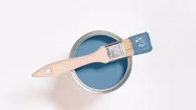
In identifying a colour that would connect with the overall trend of looking both ways, we noted that all the key trends for 2016 had an element of gold in them. Out of the broad palette of yellows we identified, we have carefully selected the one yellow that best represents the golden influence of the coming year’s colour trends. We have selected a gold influenced monarch which is both bright enough to attract attention and combines well with other tones.
Gold and gold tones are being used everywhere in the design world. It is a recurring colour and material at design fairs and in graphic design as well as in architecture, fashion, beauty and interior decorating. We feel that this is a beautiful next step, a natural evolution and transition from the coppery orange that was the colour of the year for 2015. We’ve designed a colour palette to work beautifully with the Colour of the Year 2016 to create a tonal effect, a relaxed neutral combination or something more surprising.
Here are some ideas on how to decorate your home with Gold.
Storybook corner
Cosy and cocooning, Monarch Gold sets the scene for a relaxing reading nook.
Expert tip: Try adding a dash of vibrant yellow to bring Monarch Gold to life – or add a dusky pink to bring out its softness.
Make an entrance
Cherish your hello’s and goodbyes in a hallway that really feels like home with this comforting, earthy hue.
Expert tip: Pick a similar toned coordinating colour and create a two-toned paint effect on your stairs. This helps draw the eye around the space, making it feel larger.
Study in gold
Acting in the same way as a soothing neutral, Monarch Gold brings a calm mood to an office space – all the better for focusing on the task at hand.
Expert tip: A little bit of Monarch Gold goes a long way – even if you only have a small area of wall or ceiling to play with, this colour adds oodles of personality without being overpowering.
The right stripes
Stripes will never date (just look at the Breton t-shirt if you don’t believe us). Combine Monarch Gold with Atlas Blue, Lucky Penny and Soft Almond 2 in bold bands across walls to achieve a softer take on this graphic look.
Expert tip: Play with the widths of your stripes to create even more visual interest and subtlety.
Tone on tone
Add Monarch Gold to a muted pastel scheme and you’ve instantly given your space a sophisticated update. Use Paper Mint and Atlas Blue with Monarch Gold to recreate this look.
Expert tip: Painting your woodwork and dado rails the same colour as your walls gives a really contemporary effect, especially in a matt finish.
Cooking up a storm
Monarch Gold is the ideal ingredient for adding a touch of spice to the heart of your home – go to town and use liberally across wall space, or add a hint of colour as a splash-back.
Expert tip: Don’t have a rustic style kitchen? Fear not – add a lick of Monarch Gold to walls and display wooden chopping boards and utensils against your counter top for a farmhouse feel.
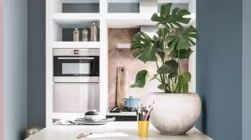
Back to nature
Monarch Gold and natural materials were made for each other. Bringing out the qualities of wood and other natural textures, this mid-tone complements everything from blonde timbers to rich leather.