Evoke joy with striking orange
Bring joy to a room with striking orange, inspired by the beautiful paintings of Claude Monet.
Colour contrast
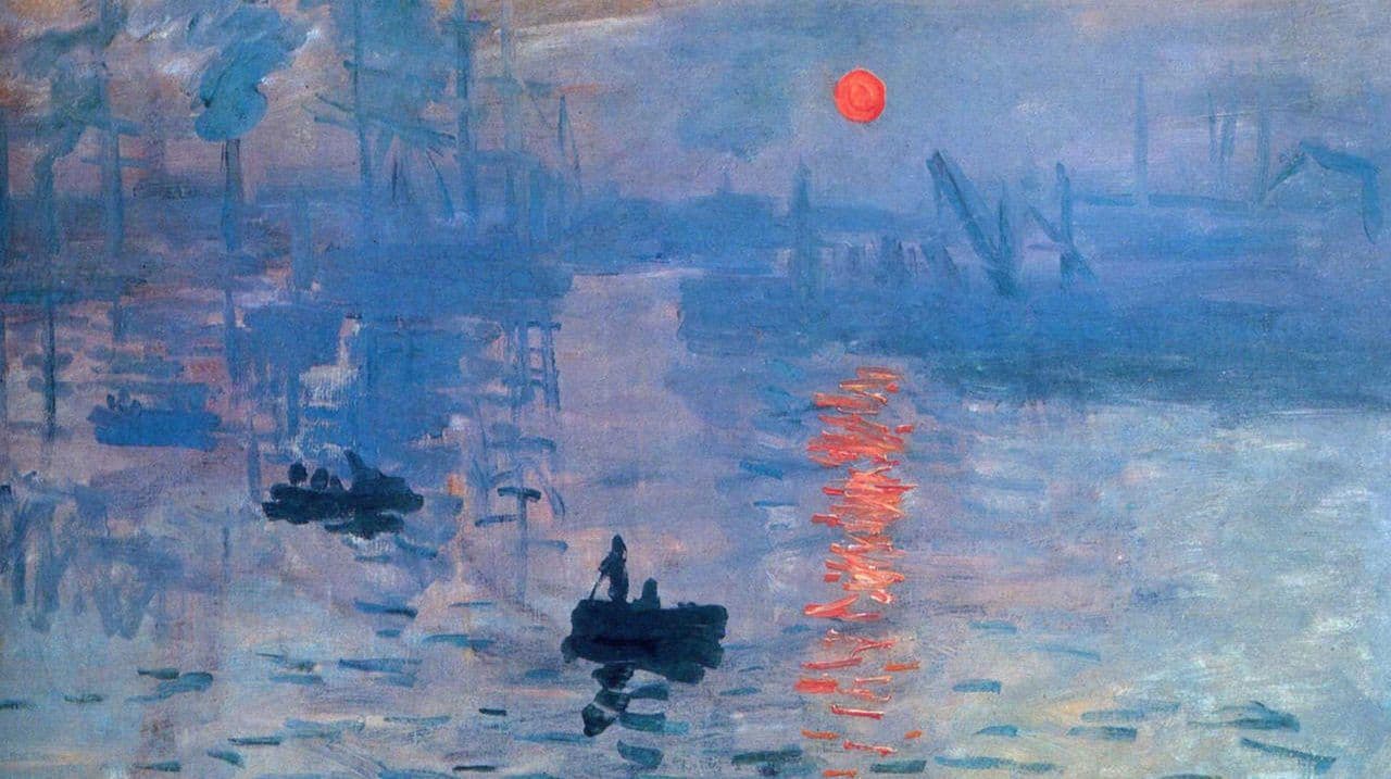
Considered to be the very first Impressionist work, Claude Monet’s dramatic painting Impression, Sunrise is famous for its glowing red-orange sun in the middle of a deep blue sky. Monet once said: “Colour owes its brightness to force of contrast rather than to its inherent qualities” – and this is exactly why the painter chose to feature orange and blue on the same canvas. These two hues create a vibrant contrast, as they sit on opposite sides of the colour wheel.
Spice up your life
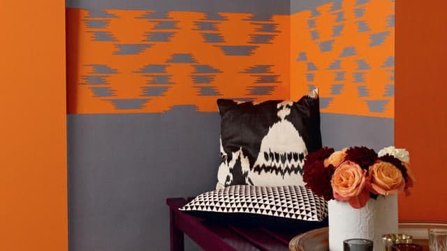
If Monet’s daring use of orange takes your fancy, why not add a dash of this vibrant hue to your own colour scheme? Just as Monet used contrast for impact, you could try juxtaposing greens and blues with citrus orange shades, such as vibrant orange, coral or tangerine. Orange looks fantastic when paired with contrasting hues, like blue and greens, but can also take on a dynamic look when colour blocked with similarly bright colours, like grapefruit and juicy berry.
Create a warm glow
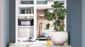
If you’d like to use orange to create a more subtle look, replace the bright shades with more muted orange hues, such as pumpkin or mahogany. These hues will still add vibrancy to the space but will also evoke a sense of warmth and sophistication. Or, if you love orange but don’t want to dominate the space, try adding orange accents through soft furnishings and accessories.